 New Horizons
 Project Management Academy
 Six Sigma Online
 TCM Security
 TRACOM
 Velopi
 Watermark Learning
 Login
Login


Project Managers know how clients will react when presented with large amounts of data in the form of a spreadsheets with hundreds (better yet, thousands!) of rows of numbers with no context or clear meaning; it will not be a reaction of gratitude. On the other hand, if that same large dataset is presented using data visualization and a quality tool, like a histogram, then the client will be able to see the connection to the project decision needed. Histograms are a powerful tool for Project Managers.
On this page:

Free Download:
The Ultimate Data Quality Guide
Learn about the 7 data quality
tools every project manager
should know!
What is a Histogram?
Histograms are a statistical tool included in the Project Management Professional (PMP)® certification exam as they are used by project managers to plan and manage quality.
Quality Tools
When preparing for the PMP certification exam, or as a PMP certification holder, you will know of the “Seven Tools of Quality” credited to Kaoru Ishikawa, a professor of engineering at Tokyo University and the father of “quality circles.” The seven quality tools are:
- Cause and Effect Diagrams
- Check Sheets
- Control Charts
- Flow Charts
- Histogram
- Pareto Charts
- Scatter Diagrams
As the basic level, the type of project work, the data available, and the question to be answered will determine which tool, or even combination of tools, is the best fit. The PMP certification exam may include questions asking to identify one of the seven tools or more scenario-based questions about the use of a quality tool.
Histogram
The term histogram is credited to Karl Pearson (1857 – 1936), an English mathematician and bio-statistician. Note that he is credited with the term “histogram” not the actual tool itself which likely was already in existence.
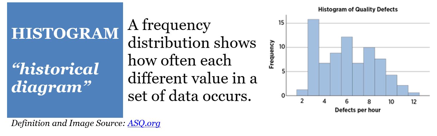
The American Society of Quality (ASQ) lists the histogram as not only one of the seven quality tools, but the most frequently used graph to show frequency distributions. As first glance, one not trained in PMP quality tools may think that it is merely a bar graph. And while it is a bar graph, it is also a specific visual representation of data that conveys meaning in how it is structured.
Histogram as Quality Tool for PMP Exam
How is a histogram used? The histogram is used for statistical analysis in financial and industrial settings. It also has application in projects and is included in the body of knowledge assessed for the PMP exam. Consider these definitions of the term histogram but from the lens of a project manager or PMP credential holder:
a diagram consisting of rectangles whose area is proportional to the frequency of a variable and whose width is equal to the class interval (source: Oxford Languages via Google)
the resource histogram is specifically a bar chart used for displaying the specific amounts of time that a particular resource is scheduled to be worked on over a predetermined and specific time period (source: Project Management Knowledge Definitions)
For project managers without formal training in statistics or mathematical computations, it is likely that last definition that sparks the “ah-ha!” moment. The histogram, a bar graph, provides a means to display variable data measured on a continuous scale for metrics such as time, temperature, weight, and speed. In that way histograms are a powerful quality tool. Additionally, from the lens of a PMP credential holder, a resource histogram is a specific use of the tool using project resource data to provide insight into allocation over time. For project managers who know the “Total Quality Management” philosophy and/or the “Six Sigma” project management methodology, histograms are familiar. In those settings the tool is included as a means to determine productivity and asses a process.
Histograms Components
The visual components of a histogram convey meaning, so project managers need to know what the proportions of each part mean.
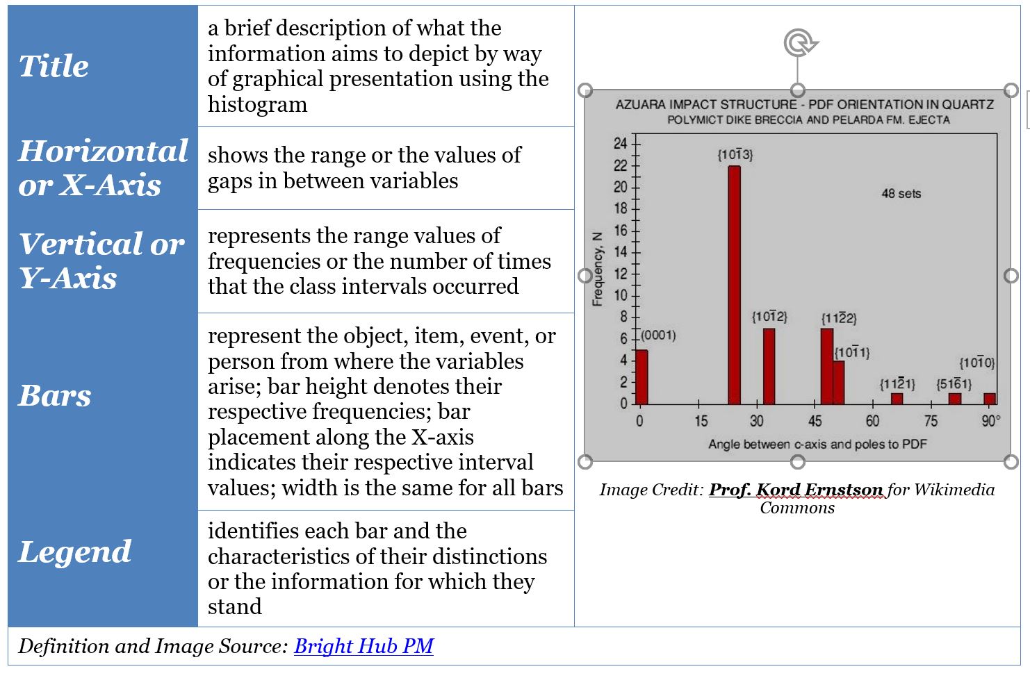
The PMP histogram provides information about a process in terms of time and the occurrence of specific aspects. Instead of an overwhelming list of numbers, the histogram conveys critical information with an image.
What Makes the Histogram Such a Special Bar Graph
PMP credential holders may wonder why if the histogram is a bar graph it has its own special name and it included in the PMP certification exam. The answer is that while a bar graph displays data in bars, the bars of a histogram represent continuous data for a specific range that are measured in terms of frequencies and intervals; thus, the bars are connected to each other.
Studying for the PMP Exam?
PMP® Quality Tools: Histogram vs Pareto
Just as all bar graphs are not histograms, they are also not Pareto charts. Like the histogram, the Pareto uses the bar placement to convey information. The key difference being that in a Pareto, the bars are organized by the order of impact. The PMP certification exam may also include questions asking for your interpretation of bar chart, histogram, and Pareto including when to use which.
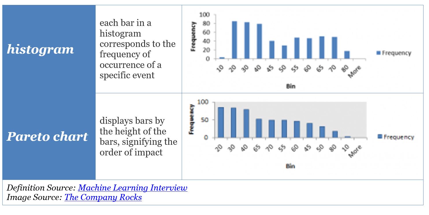
Both histograms and Pareto diagrams require statistical analysis. Review your project management software to see what tools it may include for creation of these tools.
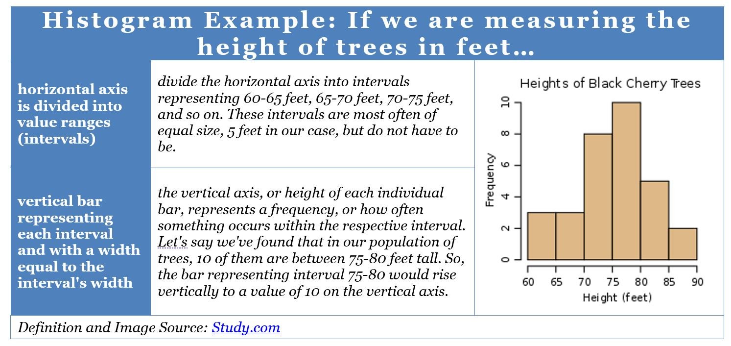
Histogram Examples
You now know that a histogram uses bars and the height of the bars to convey information. How does data actually go from a list into a graphical display? The Study.com example builds from a classical histogram using data about trees.
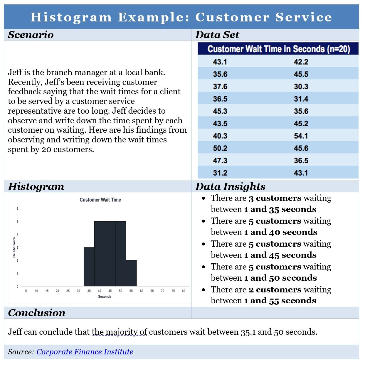
Reading about data sets and statistical analysis can make it hard to see how that turns into a graphical display. With this example from the Corporate Finance Institute, the scenario depicts a common situation in which data can provide insight into the customer experience.
Histogram Uses in PMP setting
A histogram is a quality tool thus the American Society of Quality (ASQ) provides a great listing of when to use one:
- analyzing whether a process can meet the customer’s requirements
- analyzing what the output from a supplier’s process looks like
- seeing whether a process change has occurred from one time period to another
- determining whether the outputs of two or more processes are different
For the PMP environment it is important that the project manager know when to use a histogram. Examples include but are not limited to:
- determine the profitability of a project activity
- monitor different processes
- analyze the intensity of each project intensity
- determine which aspect of the project process should be further analyzed for improvement
- illustrate underlying distributions of data
- capture process information for predicting future outcomes
- provide insights into process changes
- conveys large data sets in concise format for easier comprehension
Project managers should also know the use of a histogram as a resource tool. Consider this resource histogram pmp example which combines a Gannt chart with a histogram to better understand the scope of how and when resources are used.
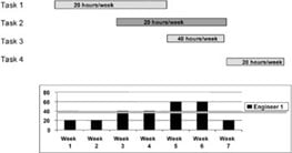
Project software can help create the resource histogram in which as changes are made to a resource, the diagram will convey the potential impact. With a resource histogram PMP, the Project Manager has a single page tool for the team and/or leader to better understand and manage the resources.
Histogram within PMP certification exam
The histogram for the PMP encompasses knowing what the tool is, the value it brings to the quality process, how it compares to other tools, and how to interpret the data it conveys.
Studying for the PMP Exam?


 New Horizons
 Project Management Academy
 Velopi
 Six Sigma Online
 TCM Security
 TRACOM
 Watermark Learning